Creating beautiful geographical maps with Python
Sometimes, you want to plot your data on a world map. In Python, we can make use of Basemap from the Matplotlib toolkits to do just that!
This post will give you a basic rundown of some of the basic functions to get you started.
What you need
Required:
- matplotlib
- mpl_toolkits.basemap

Optional:
- pandas
Building a basic map
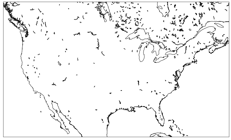
First, let’s create a Basemap object instance. We can specify some useful constructor arguments to configure the map.
We can specify the resolution of the coastlines and lakes using the resolution argument. Default to c for crude, l for low, i for intermediate, h for high, and f for full.
We can specify the projection of the map using the projection argument, which describes what transformations to employ to represent the two-dimensional curved surface of the globe on a plane. The manual shows a list of projections available.
We can also specify which part of the globe to plot by defining the coordinates of a bounding box. The llcrnrlon and llcrnrlat defines the lower-left corner geographical longitude and latitude. The urcrnrlon and urcrnrlat defines the upper-right corner geographical longitude and latitude.
import matplotlib.pyplot as plt
from mpl_toolkits.basemap import Basemap

fig, ax = plt.subplots(figsize=(14, 10))

# Drawing the base map
# The lat long bounding box bounds the United States
map = Basemap(resolution="i", projection="merc",
              llcrnrlat=22, llcrnrlon=-130, urcrnrlat=54, urcrnrlon=-60)

# This is just so we can see something on the plot
# We will explain this later
map.drawcoastlines()

plt.show()
Map background
After creating a map instance, the map is still empty, we need to draw the background of the map. By calling different map background methods, we can draw the coastlines, country lines, state lines, fill in colors, etc. Here, we will go through a few common and useful ones.
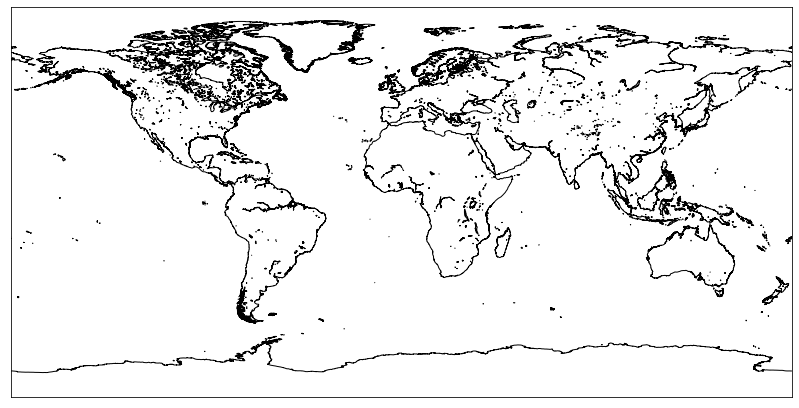
drawcoastlines
This draws the coastlines of the map.
import matplotlib.pyplot as plt
from mpl_toolkits.basemap import Basemap

fig, ax = plt.subplots(figsize=(14, 10))

map = Basemap(resolution="i")
map.drawcoastlines()

plt.show()
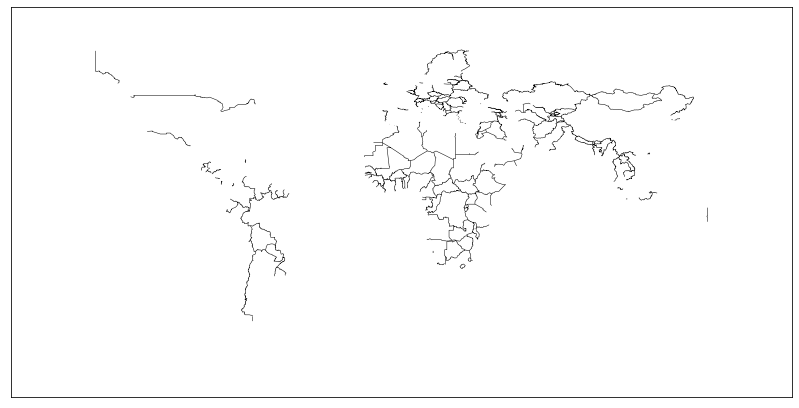
drawcountries
This draws the country lines of the map.
import matplotlib.pyplot as plt
from mpl_toolkits.basemap import Basemap

fig, ax = plt.subplots(figsize=(14, 10))

map = Basemap(resolution="i")
map.drawcountries()

plt.show()
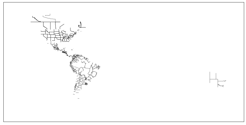
drawstates
This draws the Americans and Australian state lines.
import matplotlib.pyplot as plt
from mpl_toolkits.basemap import Basemap

fig, ax = plt.subplots(figsize=(14, 10))

map = Basemap(resolution="i")
map.drawstates()

plt.show()
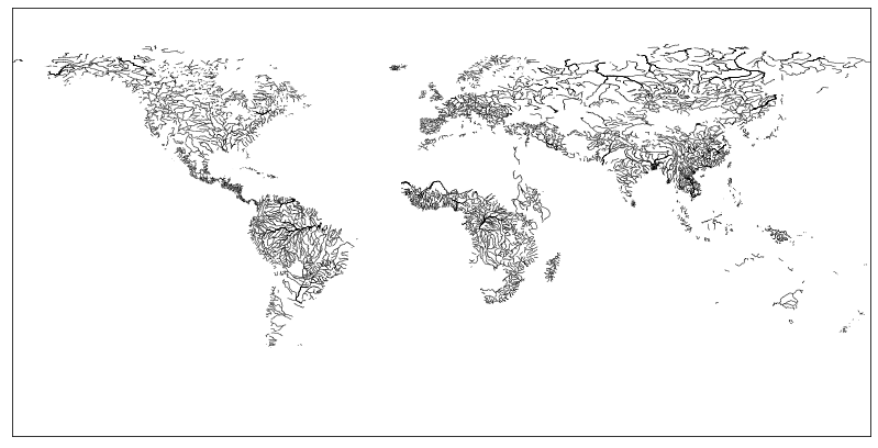
drawrivers
This draws the rivers on the map.
import matplotlib.pyplot as plt
from mpl_toolkits.basemap import Basemap

fig, ax = plt.subplots(figsize=(14, 10))

map = Basemap(resolution="i")
map.drawrivers()

plt.show()
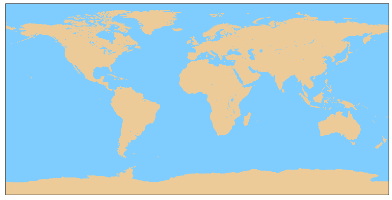
drawlsmask
This fills in the colors of the ocean, lakes, and lands on the map.
import matplotlib.pyplot as plt
from mpl_toolkits.basemap import Basemap

fig, ax = plt.subplots(figsize=(14, 10))

map = Basemap(resolution="i")
map.drawlsmask(land_color="#ECCB98", ocean_color="#7FCDFF")

plt.show()
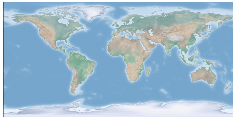
shadedrelief
Use the shaded relief image to plot the lands and oceans.
import matplotlib.pyplot as plt
from mpl_toolkits.basemap import Basemap

fig, ax = plt.subplots(figsize=(14, 10))

map = Basemap(resolution="i")
map.shadedrelief()

plt.show()
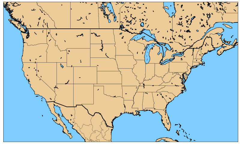
Combining the methods
Here is a sample of a filled-in map for the sections below.
import matplotlib.pyplot as plt
from mpl_toolkits.basemap import Basemap

fig, ax = plt.subplots(figsize=(14, 10))

map = Basemap(resolution="i", projection="merc",
              llcrnrlat=22, llcrnrlon=-130, urcrnrlat=54, urcrnrlon=-60)
map.drawcoastlines()
map.drawcountries(linewidth = 2)
map.drawstates(color='0.2')
map.drawlsmask(land_color="#ECCB98",
               ocean_color="#7FCDFF")

plt.show()
There is a lot more you can do with the map background, which you can check out from the manual.
Plotting the data
Now that we have the basis of a map set up, we can begin plotting any data that we want.
Plotting the number of flights per airport
Here, I have a pandas DataFrame of the U.S. domestic flight records from Jan 2019 to Mar 2019. The DataFrame consists of the IATA code (a unique identifier of the airports), the latitude and longitude of each airport, and the number of flights that departed from each airport in these three months.
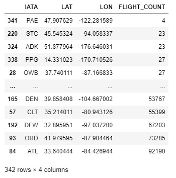
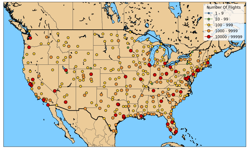
Our goal here is to plot each airport as a dot on the map and vary the size of the dots based on the number of flights departing from the airport.
First, we need to convert the longitude and latitude into the x and y coordinates for the plot. To this end, we should use the map object that we created to convert the longitude and latitude into the appropriate plot coordinates.
# Converting the longitude and latitude into x and y coordinates
x, y = map(lon, lat)
To plot the coordinates, we can call the plot method with the map object. We may indicate plot arguments to stylize the plot in a similar way to Matplotlib.
map.plot(x, y)
Here is how I plotted each airport and the number of flights.
import math
import matplotlib.pyplot as plt
from mpl_toolkits.basemap import Basemap

# Setting up colors and legends
colors = ["#3d85c6", "#6aa84f", "#f1c232", "#e69138", "#cc0000"]
labels = []
for i in range(5):
    s = 10**i
    e = 10**(i+1)-1
    labels.append(f"{s} - {e}")

# Plot map
fig, ax = plt.subplots(figsize=(14, 10))
map = Basemap(resolution="i", projection="merc",
              llcrnrlat=22, llcrnrlon=-130, urcrnrlat=54, urcrnrlon=-60)
map.drawcoastlines()
map.drawcountries(linewidth = 2)
map.drawstates(color="0.2")
map.drawlsmask(land_color="#ECCB98",
               ocean_color="#7FCDFF")

# Iterate each airport
for i, row in airport_count_df.iterrows():
    # Convert longitude and latitude into plot coordinates
    x, y = map(row["LON"], row["LAT"])
    idx = int(math.log10(row["FLIGHT_COUNT"]))
    map.plot(x, y, color=colors[idx], marker="o", markersize=idx*1.3+5,
             markeredgewidth=1, markeredgecolor="#000000", label=labels[idx], zorder=5)

# Create legends
handles, labels = plt.gca().get_legend_handles_labels()
by_label = dict(zip(labels, handles))
plt.legend(by_label.values(), by_label.keys(), loc=1,
           title="Number Of Flights", title_fontsize=12, prop={"size": 12})

plt.show()
Plotting the number of flights between airports
Here, I have a pandas DataFrame of the U.S. domestic flight records from Jan 2019 to Mar 2019. The DataFrame consists of the flight origin and destination airport IATA codes (a unique identifier of the airports), the flight origin and destination latitude and longitude, and the number of flights that flew between the two airports in these three months.
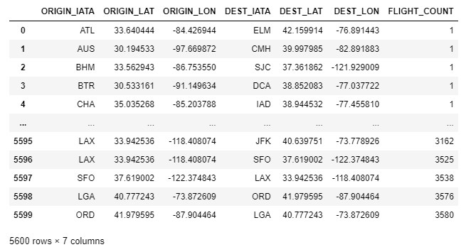
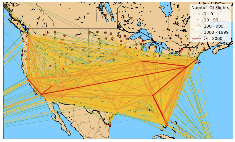
Using this, we can plot the routes between airports. To this end, our plot method should take a list of coordinates to plot a line. Here is the full code.
import matplotlib.pyplot as plt
from mpl_toolkits.basemap import Basemap

# Set up colors and labels
colors = ["#3d85c6", "#6aa84f", "#f1c232", "#e69138", "#cc0000"]
size_range = [1, 10, 100, 1000, 2000]
labels = ["1 - 9", "10 - 99", "100 - 999", "1000 - 1999", ">= 2000"]

# Plot map
fig, ax = plt.subplots(figsize=(14, 10))
map = Basemap(resolution="i", projection="merc",
              llcrnrlat=22, llcrnrlon=-130, urcrnrlat=54, urcrnrlon=-60)
map.drawcoastlines()
map.drawcountries(linewidth = 2)
map.drawstates(color="0.2")
map.drawlsmask(land_color="#ECCB98",
               ocean_color="#7FCDFF")

# Iterate each airport
for i, row in airport_count_df.iterrows():
    x, y = map(row["LON"], row["LAT"])
    map.plot(x, y, color="#cc0000", marker="o", markersize=7,
             markeredgewidth=1, markeredgecolor="#000000", zorder=5)

# Iterate each route
for i, row in flight_route_df.iterrows():
    x, y = map([row["ORIGIN_LON"], row["DEST_LON"]],
               [row["ORIGIN_LAT"], row["DEST_LAT"]])
    idx = [i for i, size in enumerate(size_range) if row["FLIGHT_COUNT"] >= size][-1]
    map.plot(x, y, color=colors[idx],
             linewidth=idx*0.6+0.4, alpha=0.5, label=labels[idx], zorder=5)

# Create legends
handles, labels = plt.gca().get_legend_handles_labels()
by_label = dict(zip(labels, handles))
plt.legend(by_label.values(), by_label.keys(), loc=1,
           title="Number Of Flights", title_fontsize=14, prop={"size": 14})

plt.show()
For more plotting options, please take a look at the documentation.
Conclusion
Hope this post helps you gain a quick understanding of how to plot your map data. You can do so much more with this tool, I encourage you to explore the documentation and see what you can come up with. A good plot tells a good story, in both senses of the sentence.